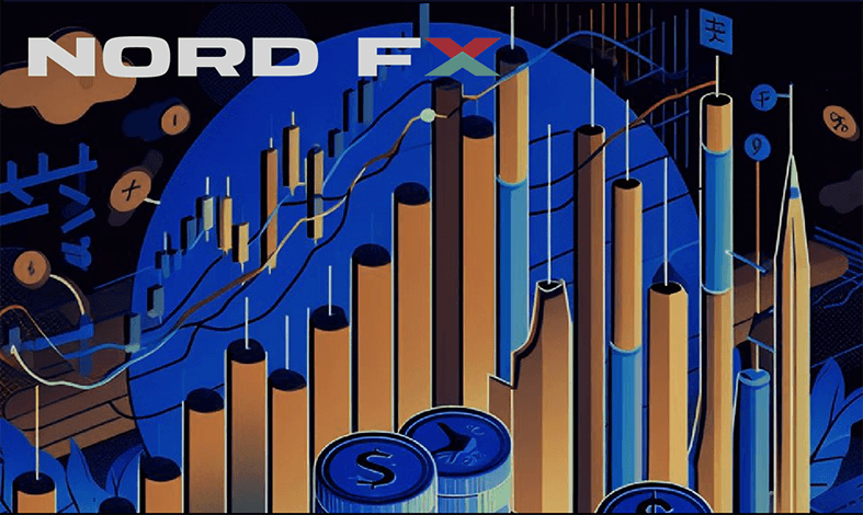
MetaTrader 4 (MT4) is one of the most popular platforms for online trading in Forex, stock, commodity, and cryptocurrency markets. A key feature of MT4 is the variety of graphical methods it offers for presenting quotations. By simply right-clicking in the open window of a currency pair, navigating to "Properties," and then to "Common," traders can select from three types of charts: Bar Chart (histogram), Candlesticks (Japanese candles), and Line Chart (linear chart). Each of these charts has its unique characteristics and advantages, which we will explore in this article.
Bar Chart
The Bar Chart, or histogram, is structured as follows: Each bar on the chart represents a specific trading period (time frame), such as one day (D1), one hour (H1), or one minute (M1). The top of the bar indicates the maximum price of the asset for that period, and the bottom shows the minimum. The horizontal ticks on the bar represent the opening (on the left) and closing (on the right) prices for the same period.
The development of this type of chart is closely linked to the evolution of financial markets and the need for visualizing price data for more effective analysis of market trends. The earliest primitive forms of graphical price data representation appeared in the 17th and 18th centuries. However, these early charts were quite simple and lacked detailed information. The modern Bar Charts, as we know them, began to take shape in the late 19th century. Charles Dow, an American journalist and co-founder of Dow Jones & Company, was a key figure in their development. In 1884, Dow created the first stock index, which included 11 major American companies. He used charts to track the price movements of these stocks, contributing to the popularization of Bar Charts. Although Dow is not the inventor of such histograms in the modern sense, his work played a significant role in the development and application of these charts for financial analysis.
In the early 20th century, with the development of stock markets and an increase in the number of traders, Bar Charts became a standard tool for analyzing price movements. Their popularity grew due to their ease of interpretation and ability to display detailed price information. They allow users to quickly assess key elements of price movement, including highs, lows, and the opening and closing prices for the selected time period, enabling a deep understanding of market trends and making informed decisions. With the advancement of computer technology and trading software like MetaTrader, the use of Bar Charts has become even more widespread and convenient.
Candlesticks
Each candle in Candlesticks represents a block that shows the price range for a specific period. The body of the candle indicates the difference between the opening and closing prices. The candle's shadows show the highs and lows of the price range. In standard MT4 settings, the body of a Bull candle is coloured black, and the Bear candle is white. However, traders are free to change these settings and colour the chart in any other colours.
Candlesticks are often referred to as Japanese candles, a name that stems from their history, which dates back to Homma Munehisa, a trader from the Japanese city of Sakata, also known as Sokyu Homma. This man is a key figure in the history of financial markets, especially known for his contributions to the development of technical analysis methods, including the creation of the Japanese candlestick system.
Born in 1724 into a wealthy family of merchants and receiving a good education, Homma became famous for his rice trading at the Dojima Rice Exchange in Osaka, considered the world's first futures market. There, he observed that in addition to fundamental factors like supply and demand, traders' psychology also played a significant role in price formation.
It is believed that Homma developed an early form of candlestick analysis to visualize the market's emotional state, enabling him to accurately predict price movements and amass a considerable fortune. While the exact details of his methods may be subject to debate and interpretation, Homma Munehisa's trading success made him a legendary figure in the financial world. His approaches and theories laid the foundation for many modern trading strategies.
Until the 1980s, Candlesticks were largely unknown outside Japan. This changed thanks to Steve Nison, an American analyst who discovered Japanese candles and was struck by their effectiveness. Nison studied and adapted the candlestick forecasting technique for use in Western financial markets and authored several books on the subject. Following their publication, interest in Japanese candles surged among Western traders, who quickly recognized the advantages of this method. Steve Nison's works are now considered fundamental in the field of technical analysis. Today, Japanese candles are widely used by traders worldwide, not only in Forex but also in stock, commodity, and cryptocurrency markets. Over time, various types and forms of Japanese candles (such as doji, hammer, shooting star, and many others) have been developed, each with its unique features and purposes. Numerous candlestick patterns signal potential trend reversals or continuations and allow for the creation of complex trading strategies.
However, it's important to note that such analysis requires time and experience for accurate interpretation of candlestick patterns. Different traders might interpret the same pattern differently. Statistical studies show varying degrees of accuracy, often depending on the specific pattern and market conditions. Therefore, it's recommended to use Candlesticks in combination with other forms of analysis, such as technical indicators and fundamental analysis.
Line Chart
The Line Chart is constructed by connecting consecutive closing prices of an asset over a selected period, forming a simple line that shows the general direction of price movement. The history of line charts is even more ancient than that of Japanese candles and is linked to the development of statistics and data visualization. It is one of the oldest and simplest methods of graphically representing information, closely intertwined with the history of cartography and economics.
While the exact origin of line charts is unknown, elements of them can be found even in the works of ancient civilizations. The Egyptians and Babylonians used graphical methods to display astronomical and geometrical data. In the Middle Ages and during the Renaissance, geographers, astronomers, mathematicians, and other scientists began to use such charts more actively to visualize their observations and calculations.
A significant boost to the use of statistical charts was given by William Playfair, a Scottish engineer and economist. In 1786, he published "The Commercial and Political Atlas," where he first used bar and line charts, as well as pie charts, to illustrate economic data. His work made complex data more understandable and accessible to a broader audience, which was a revolutionary innovation at the time.
Today, line charts are used ubiquitously. They are a fundamental tool for presenting time series and trends and are widely used in finance to track changes in stock prices, currency exchange rates, and other financial indicators. Due to their simplicity and clarity, line charts remain one of the most popular tools for data visualization.
***
Although all three types of charts - Bar Chart, Candlesticks, and Line Chart - serve the same purpose of visualizing price movements, they do so in different ways. Both Bar Chart and Candlesticks provide more detailed information about price movements, such as opening and closing prices, as well as highs and lows for a specific time period. The Line Chart, on the other hand, offers a more generalized view, focusing exclusively on closing prices.
The choice between these charts depends on the trader's style and preferences, as well as their trading strategy. Bar Chart and Candlesticks are better suited for active traders and those who use technical analysis, while the Line Chart is ideal for beginners or for analyzing long-term trends. In any case, understanding the features of each chart type and being able to interpret them correctly is a key skill for successful trading in financial markets.
Go Back Go Back
